Why Sonic the Hedgehog Almost Had a Completely Different Design
Aug 21st '26 9:41pm:
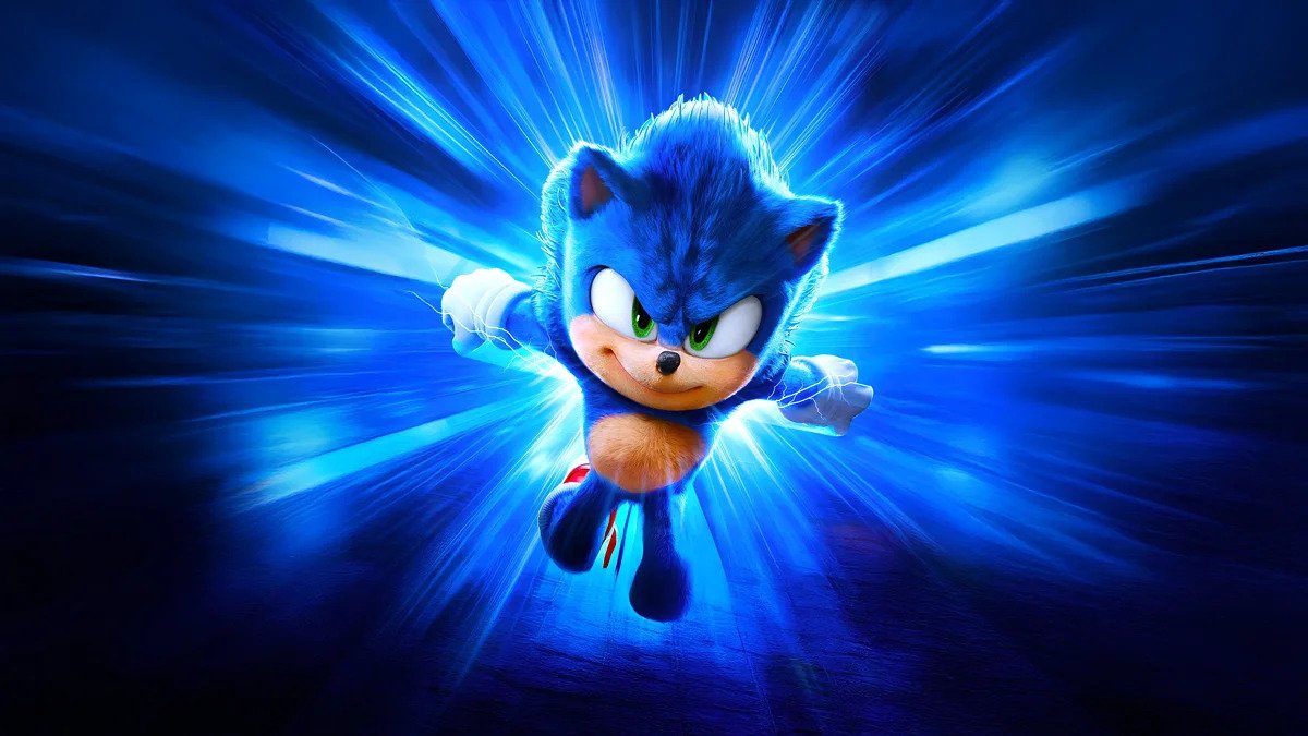
Some characters are so iconic it seems impossible to picture them any other way. Sonic is one of those cases: blue spikes, red sneakers, a cocky attitude — a design so recognizable it became synonymous with Sega itself. But the truth is this hedgehog almost never existed. Not once, but twice in the franchise's history, the Sonic we know came within a hair of being replaced by something completely different — and the second time it very nearly went wrong right in front of the whole world, in 2019.
## The hedgehog was almost a human boy
Before any sketch of a spiky blue animal existed, Sega's very first idea for a lead character wasn't even an animal. It was a human boy.
Naoto Ohshima, the designer behind Sonic, said this first proposal came together after three years working in Sega's design department — and in a pretty unplanned way. The idea hit him at night, right as he was falling asleep, and the fear of forgetting it by morning made him get up and scribble the concept down in a notebook before finally drifting off.
In that original sketch, the protagonist wasn't Sonic at all — it was a boy with spiky blue hair. The game itself was something else entirely too: an action story about twin brothers tasked with protecting the "Dream World" from a villain named Thirteen, who lived in the ominous "Nightmare World."
For years, this story existed only through Ohshima's verbal account, and he even claimed publicly that no image of that human Sonic had survived — that the idea had been scrapped too quickly to ever properly sketch out. Then, years later, Ohshima himself surprised fans by posting the original sketch on social media, proving the artwork had existed all along, tucked away for decades. It was a shock for anyone who grew up assuming Sonic had always been, from the very first draft, the hedgehog we know today.
## An armadillo, a dog, and the future Dr. Eggman also competed for the role
The human-boy idea was dropped fast, but the process of creating a mascot for Sega kept going — and it passed through some pretty unusual options before landing on the hedgehog.
During internal testing, the design team experimented with several candidates for the lead character: an armadillo, a dog, and even a rabbit, whose long, extendable ears (designed to collect objects) didn't make the cut for Sonic but were later reused in another Sega character, Ristar.
And maybe the most curious one of all: one of the tested designs was based on the likeness of Theodore Roosevelt, the former U.S. president, depicted as a stocky man in pajamas. That idea didn't work as a protagonist — but it wasn't thrown away either. It became the visual basis for Dr. Robotnik/Eggman, the villain who would chase Sonic across decades of games.
Only after going through all these alternatives did the team land on the spiky, teal design internally nicknamed "Mr. Hedgehog." And even that version wasn't approved purely inside Sega's offices: Ohshima literally took the designs to New York and asked random people in Central Park for their opinions, using those real street reactions to help decide which concept would move forward. The hedgehog won out — and the rest is history.
## Nearly 30 years later, history almost repeated itself on the big screen
If anyone thought this kind of visual identity crisis was ancient history, the 2019 "Sonic the Hedgehog" movie proved otherwise — this time playing out in real time, in front of the entire world.
When the film's first trailer dropped, the internet's reaction was immediate and brutal. The movie's Sonic had small, realistic eyes, bare hands with no classic white gloves, and — the most criticized detail of all — human teeth, visible whenever he smiled. Instead of the game's compact body, oversized head, and short legs, the filmmakers gave the character a human runner's anatomy: long legs, broad shoulders, a muscular build. The result was described by many as deeply unsettling — almost an "uncanny valley" effect, like a tiny demon trying to look cute and badly failing at it.
The backlash was so overwhelming it earned a nickname that stuck: "Ugly Sonic." And the pressure actually worked. Paramount Pictures and director Jeff Fowler made a rare and costly call by Hollywood standards: they pushed the film's release, originally set for November 2019, back to February 2020 — just to completely redo the animation and the protagonist's design, bringing it closer to the cartoonish look fans had always known from the games.
Years later, reflecting on the episode, Jeff Fowler himself described the decision as a reflection of how much the production truly listened to fans' voices — treating the whole ordeal as part of the franchise's history, alongside other challenges faced during the sequels, including shooting the second film in the middle of a pandemic.
## The rejected design never really went away
Here's the part most people don't know: "Ugly Sonic" wasn't simply thrown in the trash after the scandal. It came back — and Paramount itself decided to embrace the joke instead of running from it.
The original "ugly" design officially showed up in 2022's "Chip 'n Dale: Rescue Rangers," playing an FBI contact — a meta joke about having been "cut" from the Sonic movie. Paramount also used the design in later promotional campaigns, even giving away Christmas sweaters printed with the original design during a promotion for the third film.
What started as a marketing disaster turned, over time, into a cultural asset for the franchise itself — proof that even a design mistake can be repurposed once a brand knows how to laugh at itself.
## The part nobody wants to argue about: what if the rejected design was actually right?
This is where the story stops being just behind-the-scenes trivia and becomes a real debate. Because not everyone agrees that swapping the "realistic" Sonic for the "cartoonish" one was, without a doubt, the right call.
There's a serious argument — made by film and design critics — that the original trailer's Sonic, with textured fur, more plausible proportions, and eyes suited to the anatomy of a fast-moving animal, actually fit the film's live-action tone better. The logic is simple: the movie's world is a real one, with real humans, real cars, real cities. A stylized, cartoonish Sonic in that setting creates a visual clash that the original, more grounded design avoided.
More than that: by backing down and delivering exactly the "same old" Sonic, the studio may have thrown away a chance to give the character a cinematic identity of his own — something that set him apart from the games, instead of just being a safe, nostalgic copy. The decision pleased audiences in the short term, no doubt, and helped the films become consistent box-office successes. But by avoiding the risk, did the franchise give up a real opportunity for artistic evolution?
There's no obvious answer here. On one hand, the commercial results speak for themselves: the film trilogy grew with each installment, and the third one is already regarded by many as the best in the series. On the other hand, there's still that nagging "what could have been" question if the studio had taken the risk instead of retreating to its comfort zone.
So here's the provocation: are you on the side of the fans who forced the 2019 change, or do you think "Ugly Sonic" was actually right in this specific case — and everyone was just too scared to admit it?